Available Widgets
This section describes the available widgets and their parameters.
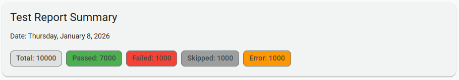
Summary Widget (summary)
The Summary Widget displays a summary of the test results, including the total number of tests and the number of tests in each status (passed, failed, skipped, error).
Parameters (SummaryWidgetParameters)
| Field | Type | Description |
|---|---|---|
title | string | (Optional) The title of the widget. Defaults to "Analysis Summary". |
Container Widget (container)
The Container Widget is used to group other widgets together. This is useful for organizing the layout of a page.
Children
The container widget has a children field, which is an array of Widget objects. These are the widgets that will be rendered inside the container.
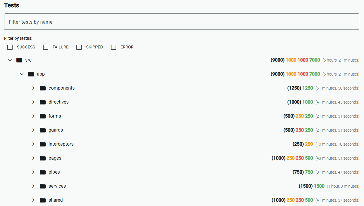
Tree Widget (tree)
The Tree Widget displays test results in a hierarchical tree structure. It allows for filtering and sorting of the tests.
Parameters (TreeWidgetParameters)
| Field | Type | Description |
|---|---|---|
title | string | (Optional) The title of the widget. |
strategy | string | The organization strategy for the tree. Possible values are 'folder' (default) and 'status'. |
sortStrategies | string[] | An array of sorting strategies to apply to the tree. Currently, the only possible value is 'name' (default). |
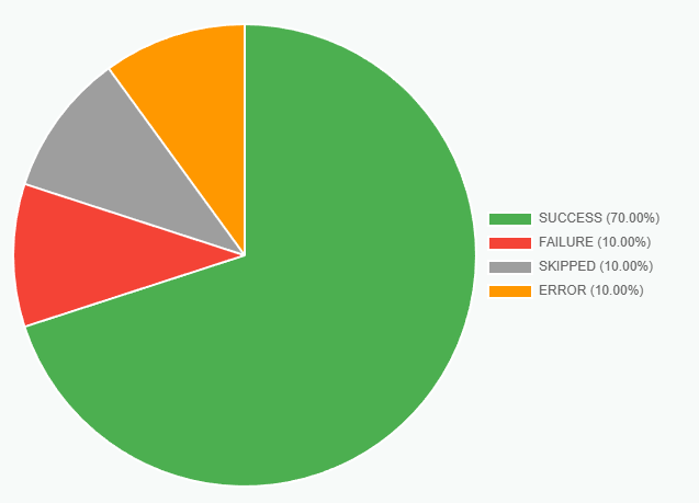
Test Distribution Pie (distribution-pie)
The Test Distribution Pie widget displays a pie chart showing the distribution of test results.
Parameters (TestDistributionPieParameters)
| Field | Type | Description |
|---|---|---|
title | object | (Optional) The title of the widget. |
subtitle | object | (Optional) The subtitle of the widget. |
strategy | string | The distribution strategy for the pie chart. Possible values are 'status' (default) and 'duration'. |
strategyParameters | object | (Optional) Parameters for the selected strategy. |
legend | object | (Optional) Parameters for the chart's legend. |
dataset | object | (Optional) Parameters for the chart's dataset. |
options | object | (Optional) General options for the chart. |
width | string | (Optional) The width of the chart. |
height | string | (Optional) The height of the chart. |
The strategyParameters object depends on the selected strategy.
duration Strategy Parameters
When strategy is set to 'duration', the strategyParameters object can contain the following fields:
| Field | Type | Description |
|---|---|---|
intervals | [DurationInterval](#durationinterval)[] | An array of DurationInterval objects that define the duration ranges for the pie chart. |
DurationInterval
| Field | Type | Description |
|---|---|---|
label | string | (Optional) The label for the duration interval. If not provided, a label will be generated automatically based on the duration range. |
color | string | The color for the duration interval. This can be any valid CSS color string. |
min | number | (Optional) The minimum duration (in milliseconds) for this interval. |
max | number | (Optional) The maximum duration (in milliseconds) for this interval. |
title and subtitle Parameters
The title and subtitle objects can contain the following fields:
See the Chart.js title documentation for more details.
| Field | Type | Description |
|---|---|---|
display | boolean | (Optional) If true, the title is shown. Defaults to false. |
position | top left bottom right | (Optional) The position of the title. Defaults to top. |
align | start center end | (Optional) The alignment of the title. Defaults to center. |
text | string string[] | The text to display. |
color | string | (Optional) The color of the text. |
font | object | (Optional) An object that configures the font of the text. |
padding | number object | (Optional) The padding to apply around the title. |
fullSize | boolean | (Optional) If true, the title will take the full width of the canvas. |
legend Parameters
The legend object can contain the following fields:
See the Chart.js legend documentation for more details.
| Field | Type | Description |
|---|---|---|
display | boolean | (Optional) If true, the legend is shown. Defaults to true. |
position | top left bottom right | (Optional) The position of the legend. Defaults to top. |
align | start center end | (Optional) The alignment of the legend. Defaults to center. |
maxHeight | number | (Optional) The maximum height of the legend in pixels. |
maxWidth | number | (Optional) The maximum width of the legend in pixels. |
fullSize | boolean | (Optional) If true, the legend will take the full width/height of the canvas. Defaults to true. |
reverse | boolean | (Optional) If true, the legend items are displayed in reverse order. Defaults to false. |
rtl | boolean | (Optional) If true, the legend is in right-to-left mode. Defaults to false. |
textDirection | ltr rtl | (Optional) The text direction of the legend. Defaults to the canvas's style. |
labels | object | (Optional) An object that configures the legend labels. |
labels Parameters
The labels object can contain the following fields:
| Field | Type | Description |
|---|---|---|
boxWidth | number | (Optional) The width of the colored box in the legend. |
boxHeight | number | (Optional) The height of the colored box in the legend. |
color | string | (Optional) The color of the label text. |
font | object | (Optional) An object that configures the font of the label text. |
padding | number | (Optional) The padding between the legend items. |
pointStyle | string | (Optional) The style of the point in the legend. |
textAlign | string | (Optional) The alignment of the text in the legend. |
useBorderRadius | boolean | (Optional) If true, the borderRadius property is used to style the legend box. |
borderRadius | number | (Optional) The border radius of the legend box. |
dataset Parameters
The dataset object allows for the customization of the pie chart's dataset.
See the Chart.js dataset documentation for more details.
| Field | Type | Description |
|---|---|---|
borderAlign | center inner | (Optional) The alignment of the border. |
borderColor | string string[] | (Optional) The color of the border. |
borderWidth | number object | (Optional) The width of the border in pixels. |
hoverBorderColor | string string[] | (Optional) The color of the border when hovered. |
hoverBorderWidth | number object | (Optional) The width of the border when hovered. |
hoverOffset | number | (Optional) The pixel value to offset the segment when hovered. |
offset | number | (Optional) The pixel value to offset the segment. |
weight | number | (Optional) The relative thickness of the dataset. |
options Parameters
The options object allows for the customization of the pie chart's general options.
See the Chart.js options documentation for more details.
| Field | Type | Description |
|---|---|---|
cutout | number | (Optional) The percentage of the chart that is cut out of the middle. |
radius | number | (Optional) The outer radius of the chart. |
rotation | number | (Optional) The starting angle to draw arcs from. |
circumference | number | (Optional) The sweep to allow arcs to cover. |